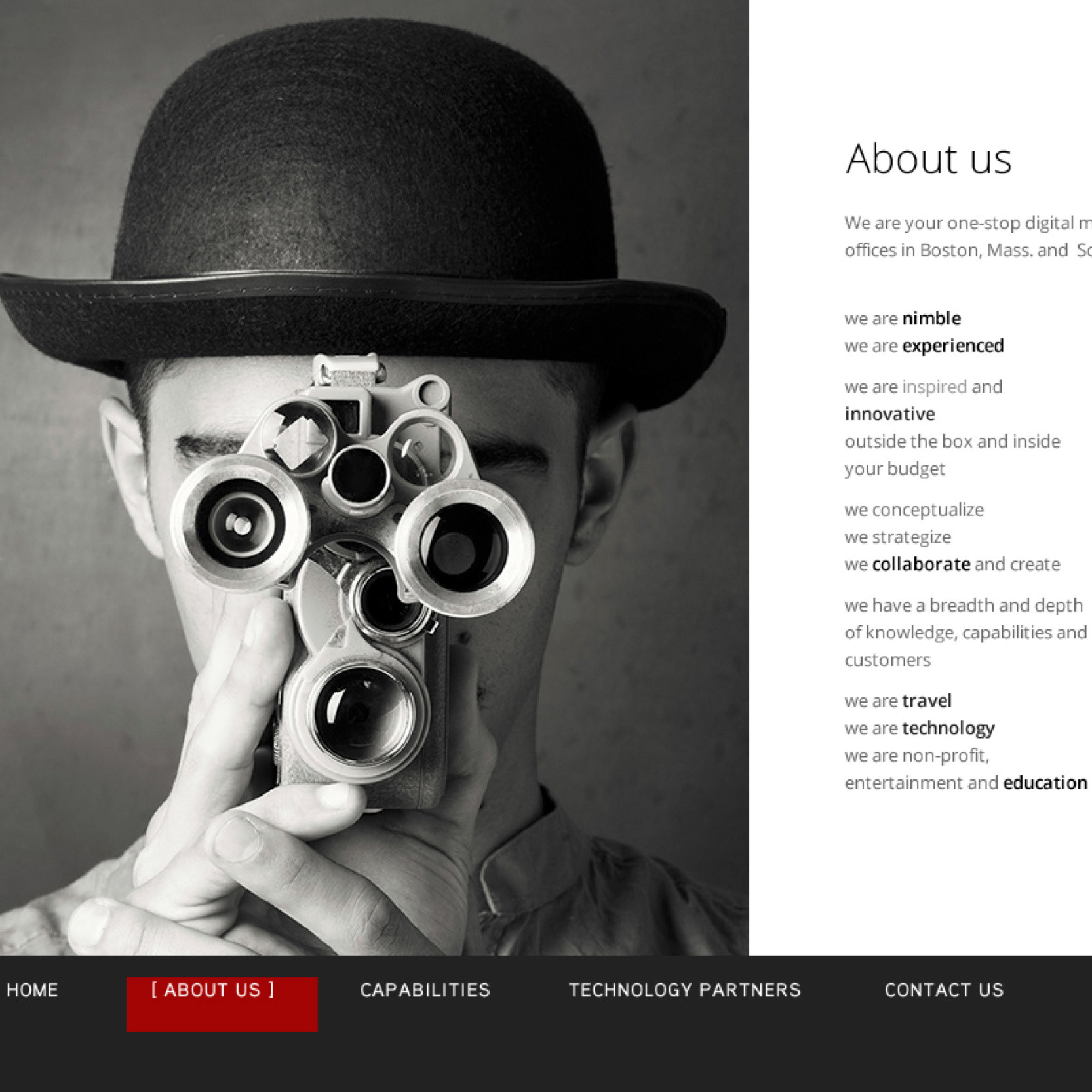
Desktop and mobile versions of the site's layouts. These were built using a responsive theme that altered tha layout using breakpoints based on the browser width.
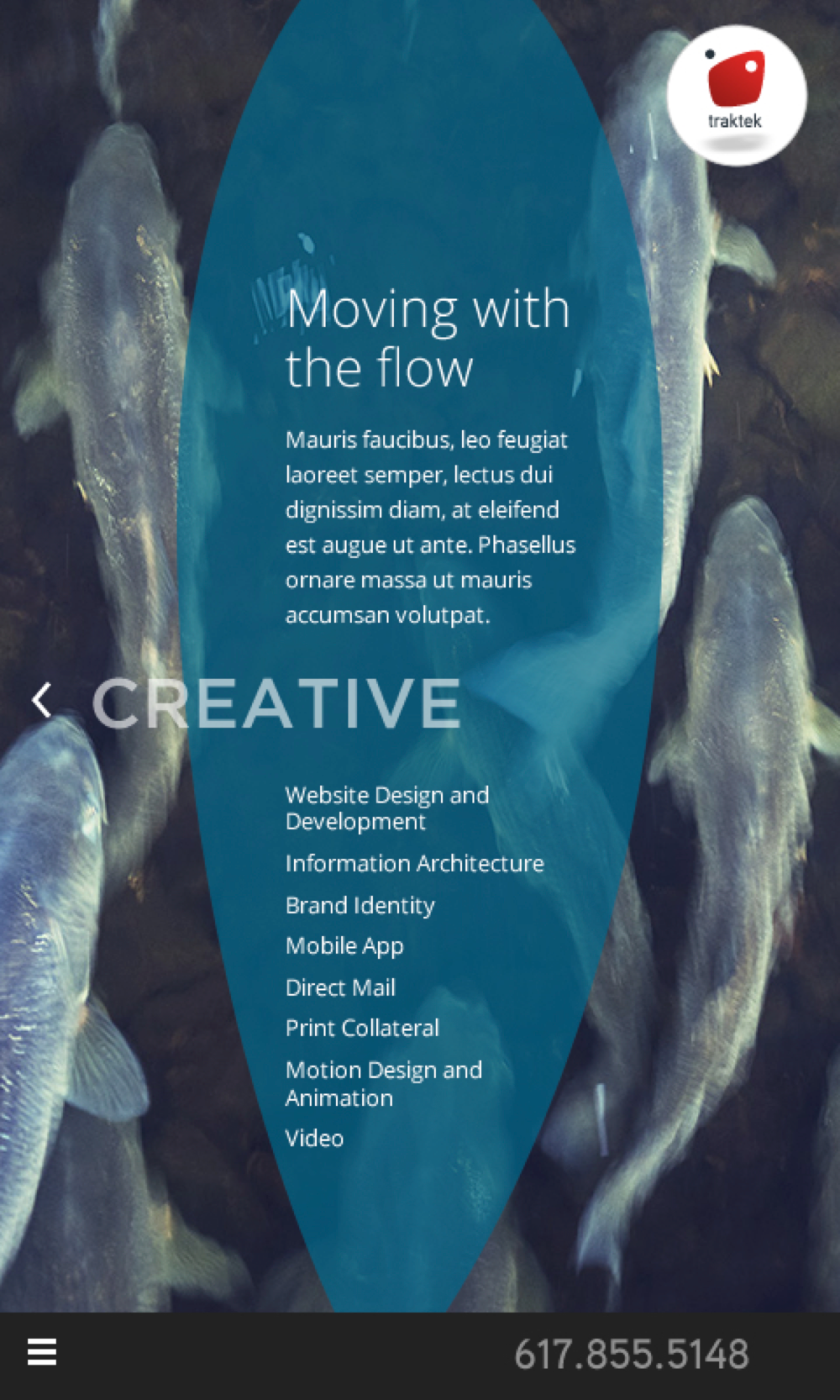
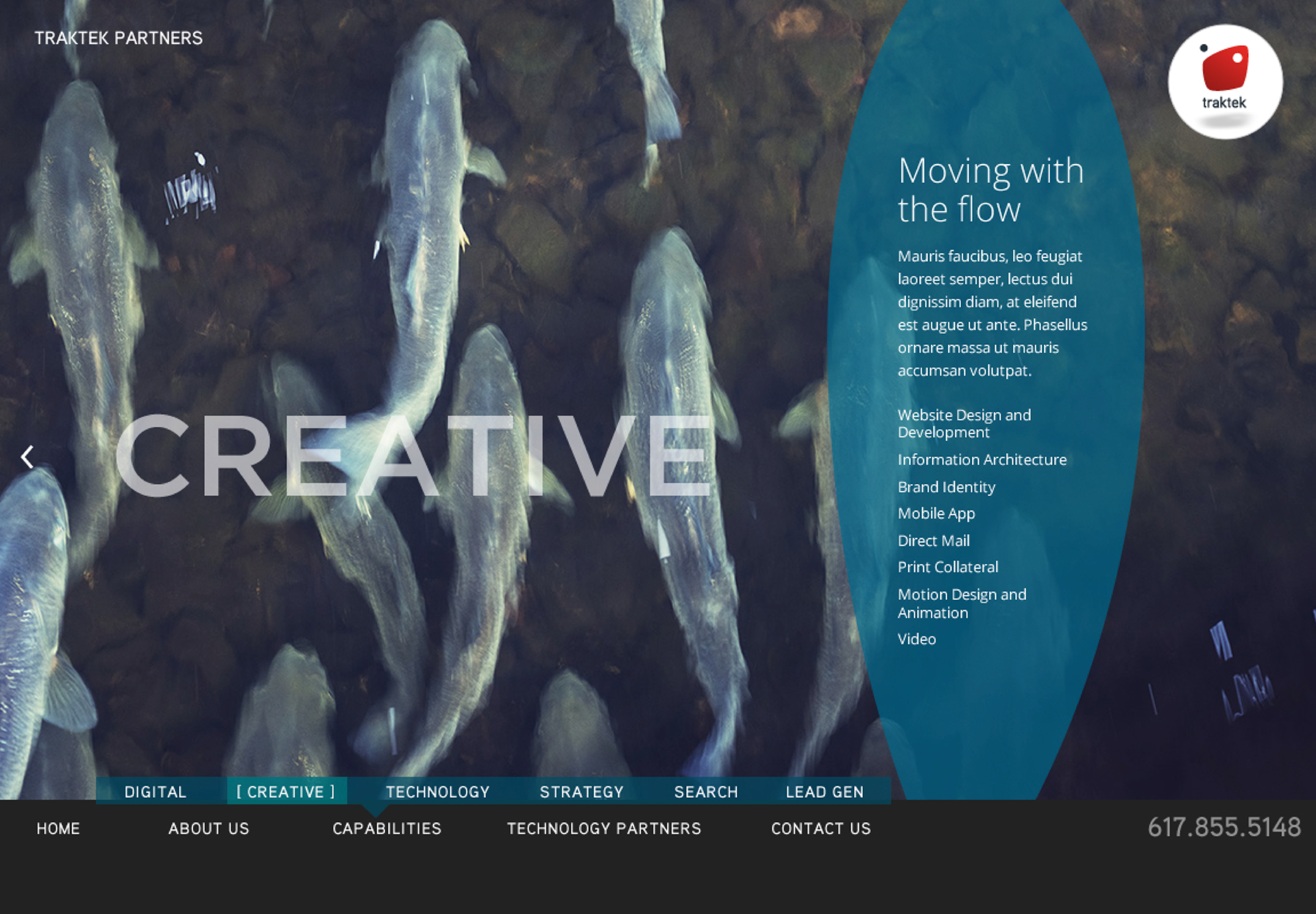
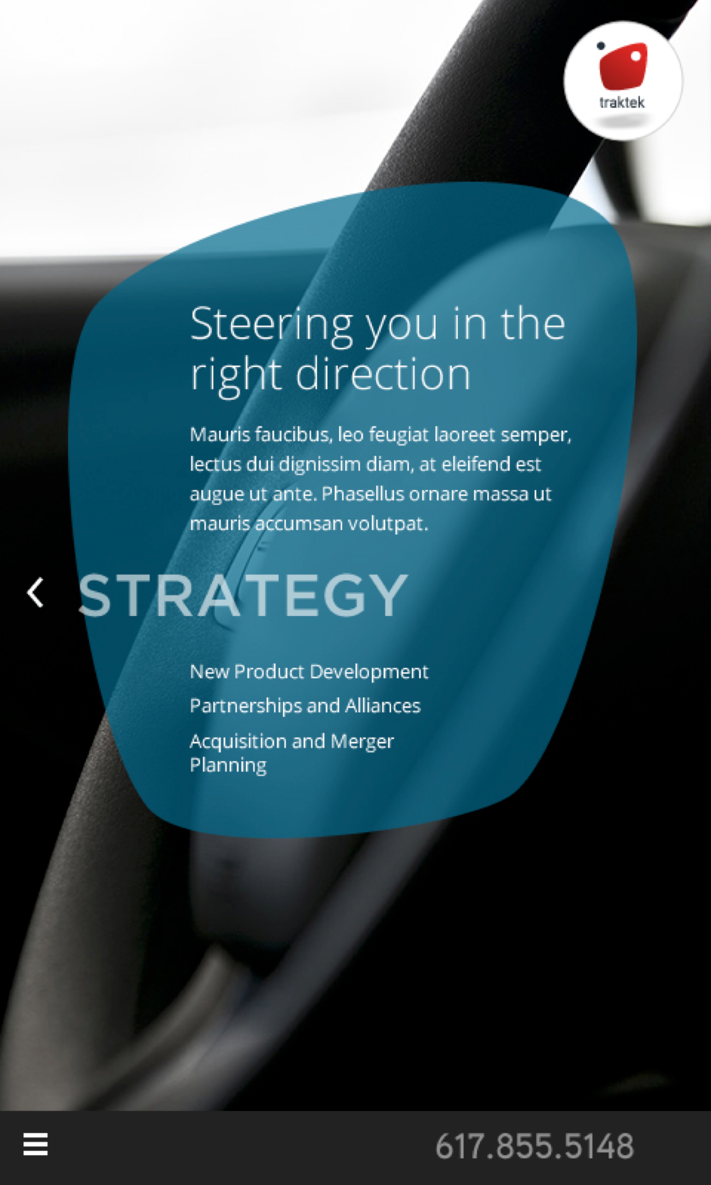

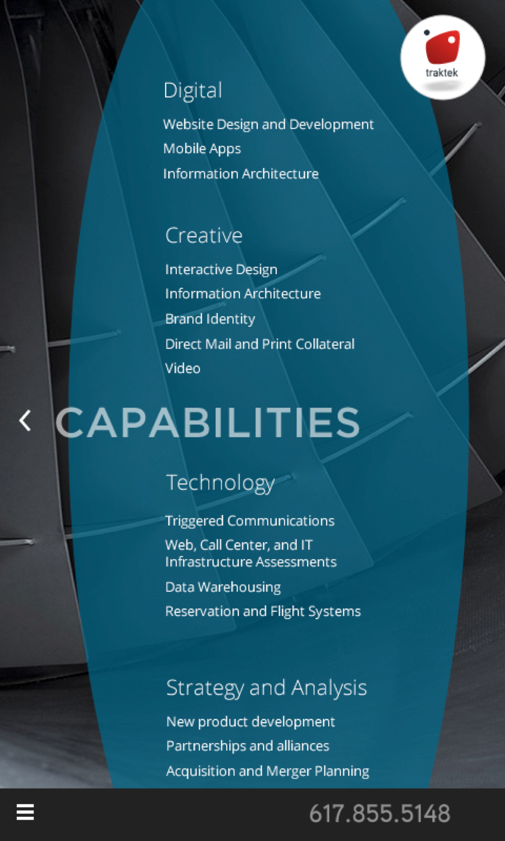
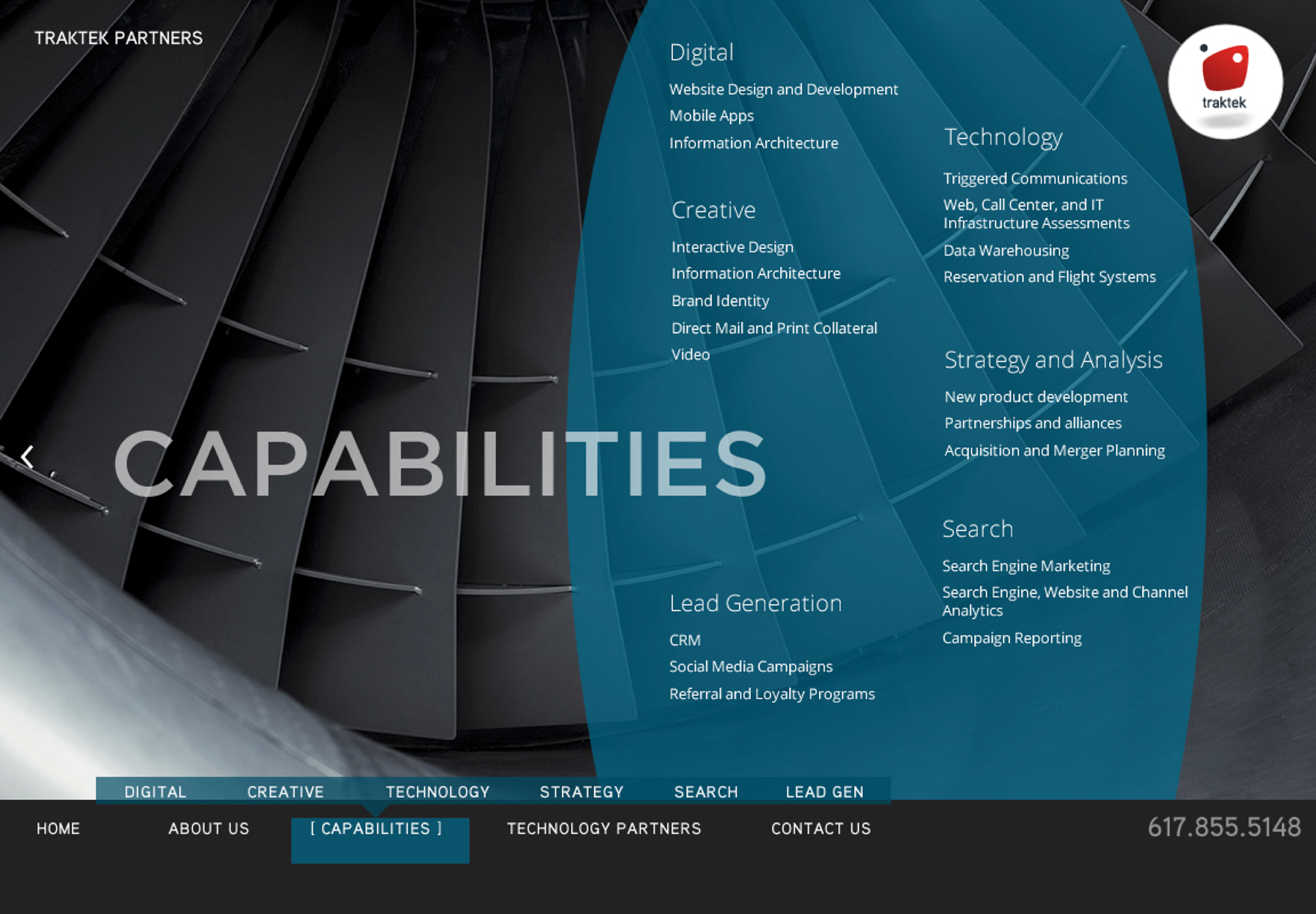
Here's a set of designs with a responsive two-panel approach. Desktop users saw a "storybook" spread layout similar what you'd see in an annual report. Mobile users would see a narrower, single-column layout.